
The beverage industry has witnessed an unexpected and noteworthy uptick, particularly within the spirits category. Despite challenging years for related industries, notably hotels, spirits have shown resilience and even growth. With the Distilled Spirits Council of the United States projecting that spirits will account for a 39.1% share of the overall beverage alcohol industry in 2021, there’s a need to understand the factors influencing this growth.
Factors Influencing Growth
- Legislative Adjustments: Changes such as permitting cocktails to-go in 22 states, the rise in curbside pickups, and the loosening of direct-to-consumer shipments have played a pivotal role in sustaining the industry amidst lockdowns.
- Brand Adaptability: Producers have shown remarkable adaptability, resonating with current societal sentiments and consumer behavior.
- Market Expansion: The market has become densely populated with brands. In 2005, a mere 57 craft distilleries existed in the U.S. Fast forward to 2020, and this number skyrocketed to 2,265, marking an 11% increase from the previous year.
The Silent Communicator, Packaging
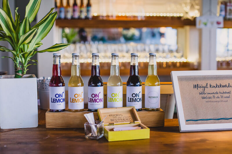
It’s evident that while the spirit inside the bottle is of prime importance, the exterior plays an equally significant role. With increasing calls for restrictions on alcohol advertisements, the emphasis on bottle and label design as a primary marketing tool is inevitable.
Key Strategies That Brands Have Adopted
- Visibility from a Distance: Rosen emphasizes the “20-10-5 principle.” A bottle’s design should be recognizable from at least 20 feet away, ensuring it stands out on store shelves.
- Brand Evolution: Brands such as Campari, under the guidance of marketing experts like Luchini, have managed to evolve without alienating their existing consumer base. A compelling example is Espolón Tequila, where simple yet effective redesign strategies led to an exponential increase in U.S. sales.
- Relatability and Direct Communication: Broad Branch Distillery, which faced challenges with its old bottle design, not only changed its design but also made its production process more transparent to cater to an informed clientele.
- Specific Targeting: Typography, colors, and design elements are potent tools in silent communication. Whether it’s luxury brands adopting all-caps wordmarks or Ocean Vodka using aqua blue to reflect environmental sustainability, subtle cues are crucial.
- Narrating Values and History: An informed clientele now seeks more than just a drink. They look for ethical choices and relatable stories. Brands like Black Button Distilling emphasize the “grain to glass” origin story, while Pack of Wolves focuses on the rich cultural tales surrounding Mezcal.
How Do These Work Together To Grow A Brand Sales?
Rosen’s “20-10-5 principle” isn’t just a casual recommendation; it’s a strategic essential. Ensuring a bottle’s design is instantly recognizable from at least 20 feet away doesn’t just enhance its aesthetics; it improves its chances of being picked up by a potential buyer. But visibility alone doesn’t seal the deal; it’s merely the first step in a multifaceted approach.
Take, for instance, the art of brand evolution. While maintaining brand identity is crucial, the industry’s fluid nature requires adaptability. A prime example is Espolón Tequila’s transformation under Campari’s stewardship. The strategy was simple: make the name more legible for English speakers and use imagery that resonated both with cultural heritage and modern sensibilities. The result? A skyrocketing of U.S. sales proves that subtle refinements can indeed lead to significant commercial impacts.
However, in today’s marketplace, the packaging’s visual appeal needs to be paired with direct communication. A modern customer base is keenly aware and constantly seeks transparency in their purchases. Broad Branch Distillery’s shift not only in design but also in candidly sharing its production process illustrates this trend. By making customers a part of their story, brands effectively bridge the gap between commerce and community.
In the abundance of bottles crowding shelves, targeting specific demographics is paramount. Subtle design elements, from the choice of typography to the color palette, act as silent yet powerful ambassadors of the brand’s core values and messaging. Ocean Vodka’s strategic use of aqua blue isn’t just a design choice; it’s a statement of their commitment to environmental sustainability.
Let’s Have a Quick Look At Rebranding Efforts
Kinky Beverages
Initially launched as Kinky Pink liqueur, by 2018, the brand’s design felt repetitive and outdated. To rejuvenate its image, the packaging received a substantial makeover, highlighting a more feminine and playful identity. This design pivot significantly enhanced Kinky’s visibility and market positioning. What is their labeling identity in a nutshell:
- Shift from Kinky Pink to a broader Kinky identity.
- Introduction of a feminine and playful design.
- Marked improvement in market presence.
Bosscal Mezcal
Once Luchini’s Pack of Wolves took the helm, the brand transformed, not only in its content but its packaging. By adopting a new bottle color and placing a spotlight on its deep-rooted Mexican heritage, Bosscal Mezcal experienced a noteworthy surge in sales. What you should remember about Bosscal Mezcal’s rebranding strategies:
- Packaging-centric transformation.
- Emphasis on rich Mexican heritage and story.
- A significant uptick in sales post-rebranding.
Absolut Vodka
One of the most iconic vodka brands in the world, Absolut went through a subtle rebranding, emphasizing its Swedish roots and premium quality. The company restructured its label, placing a larger emphasis on the word “Absolut” and highlighting its origin, “Country of Sweden.” Additionally, the logo saw a change from a traditional old-style typeface to a more modern and streamlined one. This rebranding further cemented Absolut’s position as a premium vodka in the market and played to the sentiments of those who appreciate the brand’s heritage. What is key to this brand’s identity and labeling:
- Emphasis on Swedish origin.
- Modernized typeface.
- Reinforcement of premium positioning.
Jameson Irish Whiskey
This renowned Irish whiskey brand revitalized its image to appeal to a younger demographic while respecting its long-standing heritage. The redesign focused on the iconic Jameson family crest, enhancing its visibility and significance on the bottle. The bottle shape was subtly tweaked, adopting a more ergonomic and contemporary design, and the labeling became cleaner, with a focus on the brand’s history and provenance. What is key to this brand’s identity and labeling:
- Enhanced family crest for brand recognition.
- Contemporary bottle shape.
- Streamlined label design with historical emphasis.
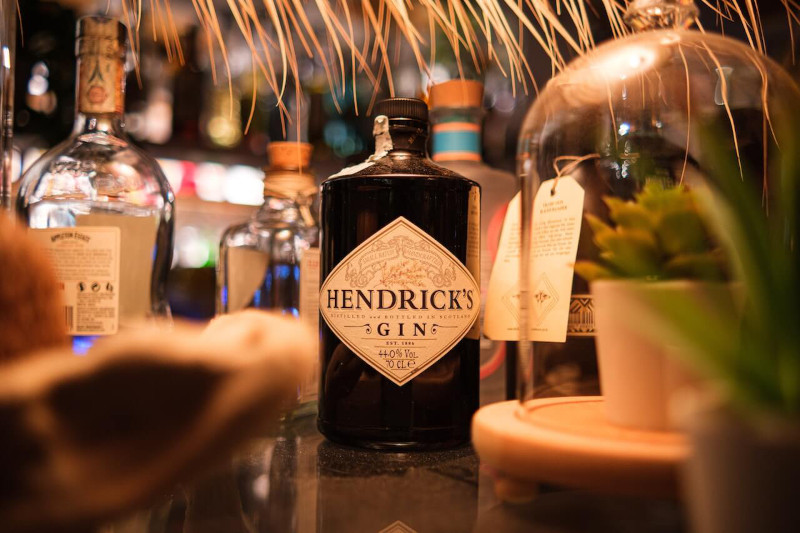
Hendrick’s Gin
While Hendrick’s Gin has always been associated with the unconventional due to its infusion of cucumber and rose, its rebranding took its distinctiveness a step further. Emphasizing its quirky Victorian-era “steampunk” aesthetic, the dark apothecary-style bottle was adorned with intricate labels, incorporating whimsical elements like cucumbers, roses, and odd machinery. This unique design approach sets Hendrick’s apart in a crowded gin market and appeals to those looking for something out of the ordinary. What is key to this brand’s identity and labeling:
- Emphasis on the Victorian “steampunk” theme.
- Detailed and whimsical label design.
- Reinforcement of its unique cucumber and rose infusion.
Sailor Jerry Spiced Rum
In honor of the legendary tattoo artist Norman “Sailor Jerry” Collins, this spiced rum underwent a brand refresh to better represent its namesake’s legacy. The label was redesigned to prominently feature Collins’ iconic hula girl tattoo, immediately tying the bottle to its tattoo-inspired roots. Additionally, the bold fonts and navy-inspired details give a nod to Sailor Jerry’s naval background, striking a chord with fans of both the tattoo and naval communities. What is key to this brand’s identity and labeling:
- Prominent display of iconic hula girl tattoo.
- Bold typography emphasizing naval heritage.
- Tie-in with tattoo culture and Sailor Jerry’s legacy.
Packaging, while seemingly peripheral, is central to the spirit’s brand identity. As the industry grows and evolves, understanding and leveraging this silent communicator will be paramount. Brands need to continuously evaluate and if necessary, re-evaluate their bottle and label designs, ensuring they remain relevant, recognizable, and resonate with their target audience.